- cross-posted to:
- firefox@lemmy.ml
- cross-posted to:
- firefox@lemmy.ml
Direct link: https://qsurvey.mozilla.com/s3/413b49c8ae9e
No lie most of those features sound like a bad idea.
Not all of them, there were a couple that were really appealing. I would especially love the ability to get metrics and data on sites and trackers I’ve blocked in a nice dashboard.
Keyboard operated control and site specific extension were appealing to me
I’d love to be able to snyc everything (all settings, including
user.js, etc.; all extensions and all of their configuration; all visual changes, includinguserChrome.cssand additional files; all website configurations, including all cookies). Basically a 1:! copy of the user profile directory.This won’t happen, though.
Cant you syncthing the profile directory between devices?
I could write a wrapper script that synchronizes the directory between two Linux machines quite easy, yes. The script would even make sure that the browser is not running.
That’s a simple task, but not my point.
(Let alone syncing the data between at least 4 different operating systems running on 3 different device classes.)
I think Syncthing runs on most OSes now. You would just point at a folder and register the token for them and it does the rest.
Thank you, I know how to synchronize data between different endpoints.
Again: this is not my point.
Don’t most ad blockers have this feature.
Yes, same with dark mode. “Dark background light text” works great and locally so sites cannot track you depending on your dark mode preference.
But integration into FF sounds good?
No idea, I assume they at least list the numbers. But I want some pretty charts…
Crappy choices. One basically is forced to like a third of the ideas presented, even though 90% is garbage. And even worse, sometimes they hand you not just one, but two or three shit sandwiches on a page, and you can only dislike one, AND you actually have to like one to proceed.
And at the end an unskippable question I’m not going to answer, so I closed the tab.
Yeah, what kind of bullshit survey format was that? I guess that format has its uses, but the way Mozilla is using it here is awful, awful, awful. I didn’t finish it. What happened to the 1 to 5 stars, points or whatevs?
They could name this “Please select least annoying feature”.
A couple screenshots so people can see what kind of question s there are:
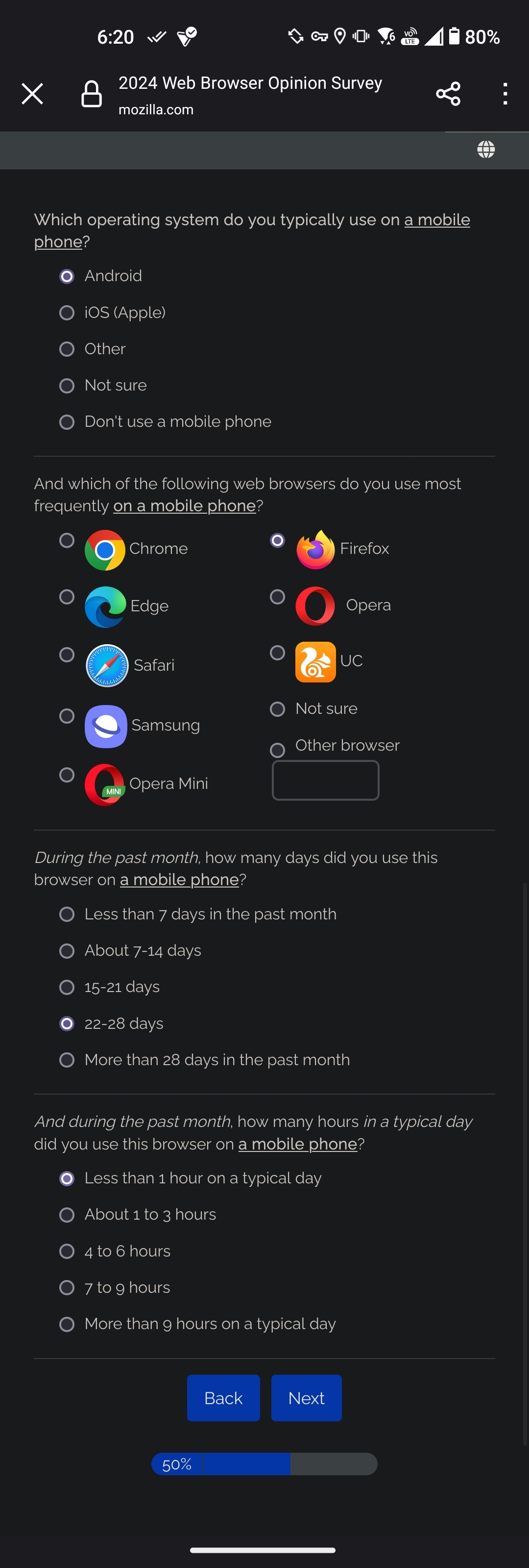
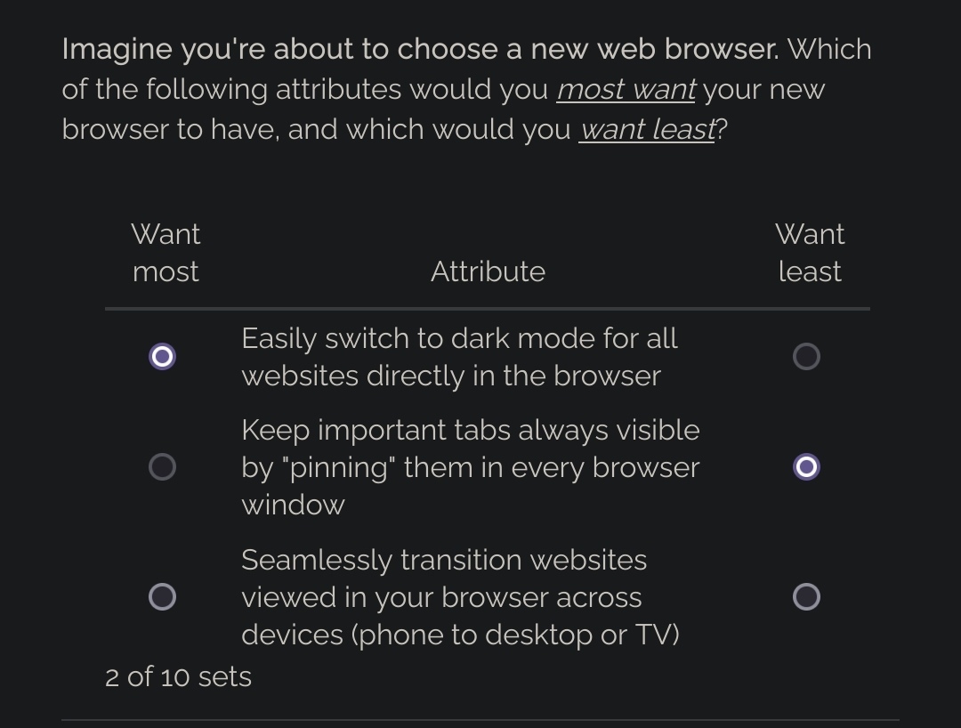
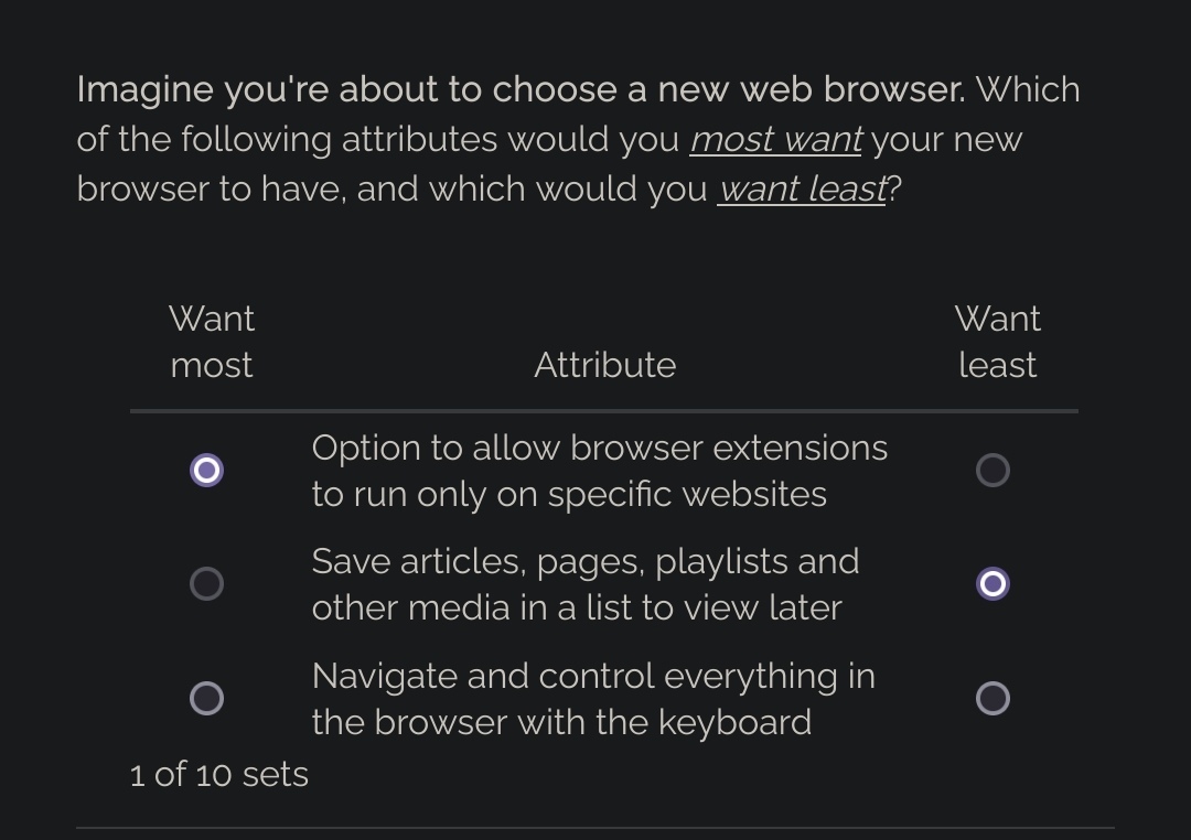
I wonder who cooked this page up, with forcing at least one (mostly stupid) idea into the “Want most” list. Some pages have three bad ideas, so one has to find the worst, and even promote the least shitty one.
Pocket! Wow! I love Pocket!
Pocket is decent but I haven’t used it in years and definitely don’t want it to be a Dev priority
It felt like glorified bookmarks with like marketing attached or something with an icon I couldn’t easily remove lol
It was useful to me in 2014 to save pages offline, but there are many other options fir that now and I have a much higher data cap.
What a dogshit survey, there were maybe 3-4 thigs I’d actually be interested in (vertical tabs, better sync, better search engine management) It’s built to confirm some manager’s bias 1000% and push AI slop, which will just end up wasting Mozilla’s limited funding. Also loved the “Pocket good!” Angle some of the pages forced you into as well.
It’s harder to remember that Mozilla is the champion for good and pure Internet when their survey seems to look so plasticky corporate that it could have come from a Republican.
And also when they killed their own namesake product because it was too hard.
I finished it and all it shows is this:

Feels good to have made firefox 100% better! /s
No need to thank me… ok, some thanks would improve my day a bit but only if you want to.- Twice as fast as your current browser
- Tools to monitor and manage browser power, battery, and memory usage
- Ability to customize your privacy, permissions, accessibility, and display settings on a site-by-site basis
Pick one that you want the most and one that you want the least.
I want all 3 though…
This survey is annoying.
Or they are trying to create a feasible dev pipeline based on user feedback.
I completely understand that. I just find them equally important and wish I didn’t have to rank them.
I would’ve preferred all questions listed at once and letting me rank them from most desired to least desired.
Heh, that’s software engineering in a nutshell. Everything’s important but you still have to pick the most important to know what to work on.
The german translation was absolutely strange.
Belgium, Switzerland, Austria not choosable??
“Convert Important Websites like GMail into Apps?” Why this weird example?
In some categories all were more important than the points in otger categories
One choice I got was “halving the speed of the browser”.
I got that one too. Either a way to test if users are paying attention or, or… I don’t know. Mistranslation? It was a bullshit option. Insulting, even.
Me too! I have no idea what that was supposed to mean but clicked “highest priority” just for the lolz
That was a feature they removed.
Some WebApps are only available as websites and don’t have a native counterpart.
I’d personally like this feature to come back so I can use those WebApps without having to have other browser-things clutter the UI (like multiple tabs, url bar, etc.) and aren’t needed when you only want to open one webapp.
Yes I know about PWAs and I am a big supporter. I even experimented with some userchrome.css to emulate a webapp experience, tried the older extension and webapp manager, and the newer “Quick Webapps” by elevenhsoft, and the experience is not really nice.
Used Element web as a Chromium webapp and while not perfect (for example no way to open links with the OS default browser) it is really good.
I just found it odd for Firefox to use GMail as an example, as people using GMail would probably also use Chrome.
Probably talking about PWAs, I imagine.
Yup


