Test trying to make something passable looking with that awful 4 color CGA palette. 250x250 pixels. Character is Parker, from Wildbow’s Pathquest, a 1940s physics student.
Lovely dithering technique on a challenging medium. Keep it up!
Very hesitant to offer any criticism (cause who the hell am I) but the hat doesn’t stand out from the background as well as you’ve done for the rest of your subject.
If I remember correctly, there was a button or a setting that will turn the white-cyan-pink-black pallet to yellow-green-red-black.
yeah, technically the CGA palette is 16 colors, with only 4 being able to be used at any one time. Many systems only had 4 sets of 4 colors allowed; the white-cyan-pink-black, yellow-green-red-black, and a darker version of those 2.
CGA could have looked much better, but its the nature of all these systems that compatibility of the colorschemes was poor, so a lot of CGA just fell into the ‘lowest common denominator’ of the default palette, the one I used.
Great, now I want a phone with a CRT screen.
Obligatory about CGA color rendering: The 8-Bit Guy explaining CGI graphics (piped).
Tl;dw
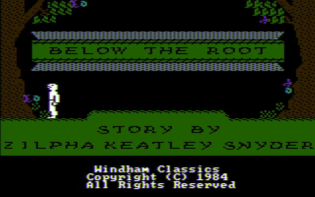
CGA 4 color 320×200 mode could produce a lot more colours on a NTSC screen.IBM PC CGA RGB
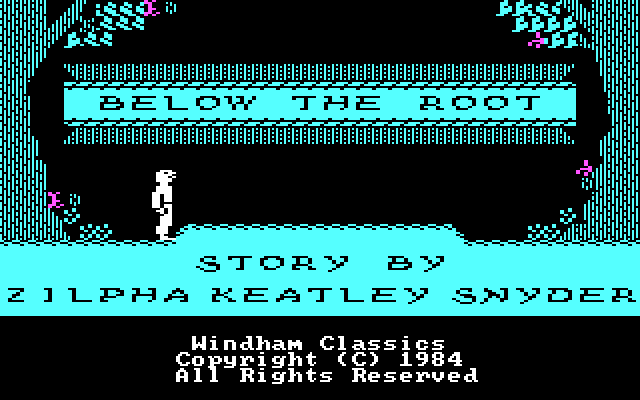
IBM PCjr. RGB
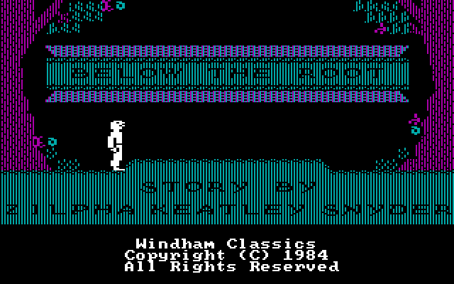
vs
IBM PC CGA Old Composite
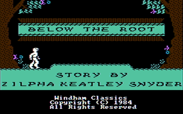
IBM PCjr Composite
