- cross-posted to:
- climate@slrpnk.net
- cross-posted to:
- climate@slrpnk.net
Earth’s hottest recorded year was 2023, at 2.12 degrees F above the 20th-century average. This surpassed the previous record set in 2016. So far, the 10 hottest yearly average temperatures have occurred in the past decade. And, with the hottest summer and hottest single day, 2024 is on track to set yet another record.
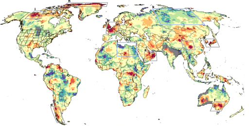
All this may not be breaking news to everyone, but amid this upward march in average temperatures, a striking new phenomenon is emerging: distinct regions are seeing repeated heat waves that are so extreme, they fall far beyond what any model of global warming can predict or explain. A new study provides the first worldwide map of such regions, which show up on every continent except Antarctica like giant, angry skin blotches. In recent years, these heat waves have killed tens of thousands of people, withered crops and forests, and sparked devastating wildfires.


deleted by creator
Missing data, or a missing prediction…since the chart is showing a difference between the two. It’s possible the model for those areas had some issue. I agree it’s worth questioning.
From the paper’s caption for that figure:
The caption from the columbia article seems wrong:
Pretty sure that’s wrong because the scale on the paper’s graphic shows a scale going from blue (0%) to dark red (100%). That means the map is much worse than what article says. Yellow is not where it “roughly match models”, it’s actually where the models underestimate by 50-75%
Sorry, I deleted my comment because when I zoomed in even further, I discovered that the grey areas didn’t specifically include Perth. I tried to reinstate it.
My original comment was:
I can’t link the grey to isolated, since much of the continent is sparsely populated. The lower south west of Australia has a higher population than the rest of that state, but that’s in contrast with the north west where there’s not many people as all.